
Star Blocks - Trying to Decide
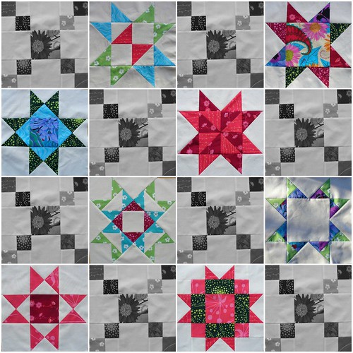
Tuesday, July 08, 2008I've been busily piecing away with the quilt along. I started with a plan and stitched half of the setting blocks accordingly. Now I'm wondering if I'm on the right path. Let me know what you think.
(I have been dabbling with the mosaic maker rather start on remaking the setting blocks, just imagine that the B&W ones are a darker colour)
Should I go with the original random prints for the setting blocks?
Or should I go with the patterned centre and use a darker print for all of the smaller squares? (I did warn you that you might need to imagine)
I have a morning this weekend set aside for stitching and was hoping to get everything in order for then. Sticking with the status quo would be easier, no remaking but I'm wondering if the other option is better.
Note also - neither option involves buying more fabric.


10 comments
Hi,
ReplyDeleteI have been looking at others who are participating in the quilt-a-long and wanted to comment on your blocks. The 1st photo with all your colorful setting blocks looks good; I personally would not go with the darker ones.
They both look good. The darker one highlights the stars more. They are the "stars" of the quilt. In the first one it seems to be a more scrappy look. I think I like the stars to be featured.
ReplyDeleteI really like the first photo - I do agree that it gives the quilt a scrappy look whereas the second photo really makes the stars jump, but since you're going to the effort of making setting blocks, I would make them jumpy too! BTW - beautiful colour choices!
ReplyDeleteI love the first photo! Love the effect! It is a happier look! I would definitely go with that one! It is your choice though.... 8-)
ReplyDeleteHappy stitchings!
Hi I love the second one more just because it jumps out at me. Actually I like the first one too. Quite a scrappy effect. Trouble is I like both scrappy quilts and formal quilts too. I think you may have to go with your gut. Anyway love your quilting on your blog
ReplyDeleteCrafty cheery
I love the first collage...it's bright and cheery and more patchworky.
ReplyDeleteI agree with the others. In the first picture the sashing blocks seem to match the randomness of your stars. I went back and looked at the original quilt Amanda Jean made, and there is still some work to do that will make the stars kind of float and that will make the stand out. Plus I hate re-doing blocks. Stick with what you'e got!
ReplyDeleteLisa
that is really hard..I like them both. So I am no help at all.
ReplyDeleteAfter a nights sleep and looking over everyone's comments, I'm sticking with the scrappy one. When I looked at the photos the next day, the coloured on just looked more like my style. Thank you for all your help. I would have been left wondering if I was just taking the easy option, as opposed to the best, otherwise.
ReplyDeleteI'm glad you chose the scrappy look. that would have been my choice as well.
ReplyDeleteYour comments make my day. I would love to hear from you.